How to customize the GLPI interior with CSS per entity
Summary
In this article we show how to apply an Iron Man-inspired internal GLPI theme using only entity CSS. After usability adjustments, the theme was maintained more safely: the sidebar menu remains customized while operational areas, forms, header, and indicators return to the default GLPI visual style.
The goal is to provide visual identity without compromising readability and operation.
Why customize the GLPI interior with CSS?
When the company wants to go beyond the login and bring visual identity to daily use, entity CSS is the most flexible path. It allows standardizing the experience without adding another maintenance layer with visual plugins.
In this example, we used the Iron Man visual language with:
- Metallic red and gold as the theme base.
- Dark sidebar menu with golden highlight on the active item.
- Main system areas preserved in the default GLPI style.
- Indicators, badges, and operational fields without visual override.
- Theme applied with controlled scope to avoid degrading usability.
Where to apply CSS in GLPI
In GLPI, go to:
Setup > Entities > [your entity] > UI Customization > Custom CSS
Paste the CSS, save, and refresh internal screens.
/*
  GLPI login theme - Iron Man comic style
  Application: Setup > Entities > [your entity] > UI Customization
  Date: 2026-02-23
*/

/* Theme visual identity base */
:root {
  --ns-iron-red-950: #140004;
  --ns-iron-red-900: #250108;
  --ns-iron-red-700: #8a0d1a;
  --ns-iron-red-500: #bc1023;
  --ns-iron-gold-600: #b6840b;
  --ns-iron-gold-500: #d4a017;
  --ns-iron-gold-300: #ffd35a;
  --ns-iron-text: #fff6da;
  --ns-arc-blue: #6fd8ff;
  --ns-arc-blue-strong: #bceeff;

  --ns-iron-login-bg: url("https://wallpapers.com/images/hd/iron-man-comics-1920-x-1200-wallpaper-fipgdbe78a8hm1gr.jpg");
  --ns-iron-logo: url("https://pngimg.com/uploads/ironman/ironman_PNG55.png");

  --tblr-primary: var(--ns-iron-red-500);
  --tblr-primary-rgb: 188, 16, 35;
  --tblr-primary-fg: #ffffff;
  --tblr-btn-color: var(--ns-iron-red-500);
  --tblr-btn-color-interactive: #dd172d;
  --tblr-btn-color-text: #ffffff;

  --glpi-logo-light-login: var(--ns-iron-logo);
  --glpi-logo-dark-login: var(--ns-iron-logo);
  --glpi-logo-light: var(--ns-iron-logo);
  --glpi-logo-dark: var(--ns-iron-logo);
}

/* Login background with red/gold overlay */
body.page-login,
body.welcome-anonymous,
body.login,
body[class*="login"] {
  min-height: 100vh;
  background-color: var(--ns-iron-red-950) !important;
  background-image:
    linear-gradient(
      145deg,
      rgb(20 0 4 / 78%) 0%,
      rgb(93 8 19 / 58%) 38%,
      rgb(212 160 23 / 30%) 100%
    ),
    radial-gradient(circle at 78% 24%, rgb(255 215 90 / 21%) 0 18%, transparent 42%),
    radial-gradient(circle at 20% 78%, rgb(188 16 35 / 28%) 0 24%, transparent 56%),
    var(--ns-iron-login-bg) !important;
  background-position: center center !important;
  background-size: cover !important;
  background-repeat: no-repeat !important;
  background-attachment: fixed !important;
  overflow: hidden !important;
}

/* Light texture for comic feel without affecting readability */
body.page-login::before,
body.welcome-anonymous::before,
body.login::before,
body[class*="login"]::before {
  content: "";
  position: fixed;
  inset: 0;
  pointer-events: none;
  z-index: 0;
  opacity: 0.24;
  background-image:
    radial-gradient(circle, rgb(255 255 255 / 22%) 1px, transparent 1px),
    radial-gradient(circle, rgb(0 0 0 / 18%) 1px, transparent 1px);
  background-size: 6px 6px, 9px 9px;
  background-position: 0 0, 3px 3px;
  mix-blend-mode: soft-light;
}

/* Top glow to reinforce login visual */
body.page-login::after,
body.welcome-anonymous::after,
body.login::after,
body[class*="login"]::after {
  content: "";
  position: fixed;
  inset: 0;
  pointer-events: none;
  z-index: 0;
  background:
    radial-gradient(circle at 50% 18%, rgb(188 238 255 / 14%) 0 11%, transparent 26%),
    radial-gradient(circle at 50% 18%, rgb(111 216 255 / 20%) 0 6%, transparent 16%);
}

/* Main login card */
body.page-login .card.main-content-card,
body.welcome-anonymous .card.main-content-card,
body.login .card,
body[class*="login"] .card {
  position: relative;
  z-index: 1;
  border: 1px solid rgb(255 211 90 / 70%) !important;
  background:
    linear-gradient(180deg, rgb(40 2 9 / 88%), rgb(18 1 5 / 92%)) !important;
  box-shadow:
    0 18px 46px rgb(0 0 0 / 52%),
    0 0 0 1px rgb(212 160 23 / 24%) inset,
    0 0 18px rgb(111 216 255 / 16%);
}

/* Logo adjusted to not crop or dominate the card */
body.page-login .glpi-logo,
body.welcome-anonymous .glpi-logo,
body.login .glpi-logo,
body[class*="login"] .glpi-logo {
  width: min(260px, 68vw) !important;
  height: 88px !important;
  margin: 0 auto 10px auto !important;
  background-image: var(--ns-iron-logo) !important;
  background-repeat: no-repeat !important;
  background-position: center !important;
  background-size: contain !important;
  display: block !important;
  color: transparent !important;
  font-size: 0 !important;
  text-indent: -9999px !important;
  overflow: hidden !important;
  filter:
    drop-shadow(0 0 8px rgb(255 211 90 / 24%))
    drop-shadow(0 0 20px rgb(212 160 23 / 24%));
}

/* Remove extra logo layers when theme injects image */
body.page-login .glpi-logo::before,
body.page-login .glpi-logo::after,
body.welcome-anonymous .glpi-logo::before,
body.welcome-anonymous .glpi-logo::after,
body.login .glpi-logo::before,
body.login .glpi-logo::after,
body[class*="login"] .glpi-logo::before,
body[class*="login"] .glpi-logo::after {
  content: none !important;
  display: none !important;
}

/* Login card typography */
body.page-login .card h2,
body.page-login .form-label,
body.welcome-anonymous .card h2,
body.welcome-anonymous .form-label,
body.login .card h2,
body.login .form-label,
body[class*="login"] .card h2,
body[class*="login"] .form-label {
  color: var(--ns-iron-text) !important;
}

/* Login fields */
body.page-login .form-control,
body.page-login .form-select,
body.welcome-anonymous .form-control,
body.welcome-anonymous .form-select,
body.login .form-control,
body.login .form-select,
body[class*="login"] .form-control,
body[class*="login"] .form-select {
  color: #fff7de !important;
  border-color: rgb(212 160 23 / 48%) !important;
  background-color: rgb(56 8 14 / 74%) !important;
}

/* Login field focus */
body.page-login .form-control:focus,
body.page-login .form-select:focus,
body.welcome-anonymous .form-control:focus,
body.welcome-anonymous .form-select:focus,
body.login .form-control:focus,
body.login .form-select:focus,
body[class*="login"] .form-control:focus,
body[class*="login"] .form-select:focus {
  border-color: var(--ns-iron-gold-300) !important;
  box-shadow: 0 0 0 0.2rem rgb(212 160 23 / 23%) !important;
}

/* Main login button */
body.page-login .btn-primary,
body.welcome-anonymous .btn-primary,
body.login .btn-primary,
body[class*="login"] .btn-primary {
  border: 1px solid var(--ns-iron-gold-300) !important;
  color: #ffffff !important;
  background: linear-gradient(180deg, #d1172d 0%, #900d1c 100%) !important;
  box-shadow:
    0 6px 16px rgb(0 0 0 / 30%),
    0 0 0 1px rgb(212 160 23 / 22%) inset;
}

/* Main button hover */
body.page-login .btn-primary:hover,
body.welcome-anonymous .btn-primary:hover,
body.login .btn-primary:hover,
body[class*="login"] .btn-primary:hover {
  filter: brightness(1.1);
}

/* Login auxiliary links */
body.page-login a,
body.welcome-anonymous a,
body.login a,
body[class*="login"] a {
  color: var(--ns-arc-blue-strong) !important;
  text-shadow: 0 0 8px rgb(111 216 255 / 24%);
}

/* Login responsive adjustments */
@media (max-width: 768px) {
  body.page-login,
  body.welcome-anonymous,
  body.login,
  body[class*="login"] {
    background-attachment: scroll !important;
  }

  body.page-login .glpi-logo,
  body.welcome-anonymous .glpi-logo,
  body.login .glpi-logo,
  body[class*="login"] .glpi-logo {
    width: min(220px, 62vw) !important;
    height: 72px !important;
  }
}

/*
  GLPI Interior - Iron Man Comic
  Focus: menu, topbar, cards, tabs, tables, and internal forms.
*/

/* Tokens applied only for internal navigation */
:root,
html[data-glpi-theme-dark="1"] {
  --ns-iron-shell-red: #86111e;
  --ns-iron-shell-red-strong: #b81428;
  --ns-iron-shell-gold: #d4a017;

  --glpi-mainmenu-bg: #180408;
  --glpi-mainmenu-fg: #f8f0d7;
  --glpi-mainmenu-active-bg: rgb(212 160 23 / 14%);
}

/* Sidebar menu with Iron Man identity */
#vertical_menu,
#menu,
.sidebar,
aside[role="navigation"] {
  background:
    radial-gradient(90% 36% at 50% -8%, rgb(255 211 90 / 10%) 0%, transparent 68%),
    linear-gradient(180deg, #220307 0%, #170206 48%, #110104 100%) !important;
  border-right: 1px solid rgb(212 160 23 / 18%) !important;
  box-shadow:
    inset -1px 0 0 rgb(255 211 90 / 7%),
    inset 0 1px 0 rgb(255 255 255 / 3%);
}

/* Base color for menu links and icons */
.sidebar #navbar-menu .nav-link,
.sidebar #navbar-menu .nav-link .menu-label,
.sidebar #navbar-menu .nav-link .ti,
.sidebar #navbar-menu .nav-link .fa,
.sidebar #navbar-menu .nav-link .fas,
.sidebar #navbar-menu .nav-link .far {
  color: #f7edd2 !important;
}

/* Sidebar active state */
.sidebar #navbar-menu .nav-item .nav-link.active {
  color: #fff8e3 !important;
  background: linear-gradient(90deg, rgb(212 160 23 / 22%), rgb(212 160 23 / 6%));
  border-left: 3px solid var(--ns-iron-shell-gold);
  box-shadow:
    inset 0 0 0 1px rgb(255 211 90 / 10%),
    0 0 14px rgb(255 211 90 / 10%);
}

/* Sidebar hover state */
.sidebar #navbar-menu .nav-item:hover .nav-link,
.sidebar #navbar-menu .nav-link:hover {
  color: #fff8e3 !important;
  background: linear-gradient(90deg, rgb(184 20 40 / 24%), rgb(212 160 23 / 6%));
}

/* Preserves badges, indicators, header, cards, forms, and work area
   with native GLPI colors to not compromise usability. */
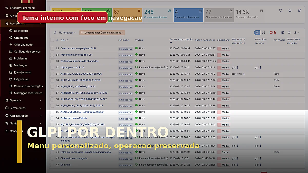
What this theme changes in the interior
- Sidebar menu with dark wine background and gold active state.
- Navigation with stronger visual identity without altering operational flow.
- Header, cards, forms, and tables kept in the default GLPI visual style.
- Indicators and badges kept with native GLPI colors.
- Customization scope reduced to avoid usability loss.
Screenshots (Playwright)
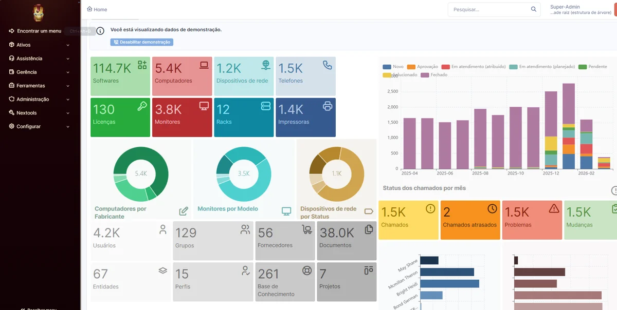
1) Dashboard with applied theme
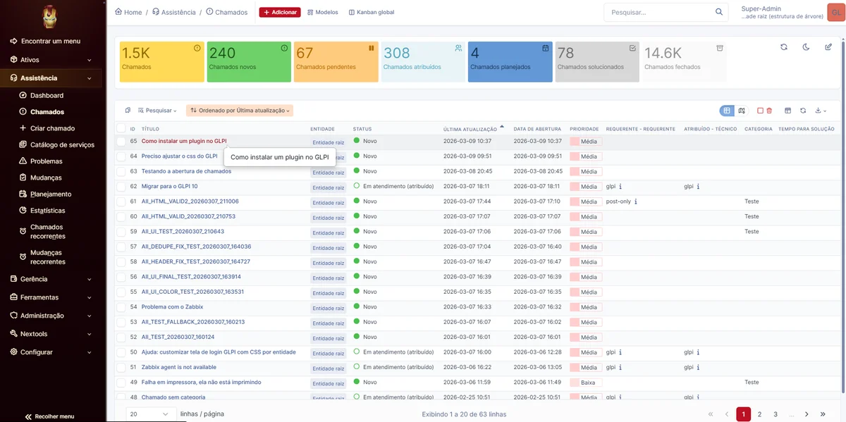
2) Tickets screen
Best practices
- Restrict heavy visual customization to the menu and non-operational areas.
- Always test dashboard, tickets, users, and reports before publishing.
- Preserve forms, status colors, and critical components in the default GLPI style.
- Keep a backup of the previous CSS for quick rollback.